Choose Your Perfect Home in Your New City

Central Locations
Central Locations
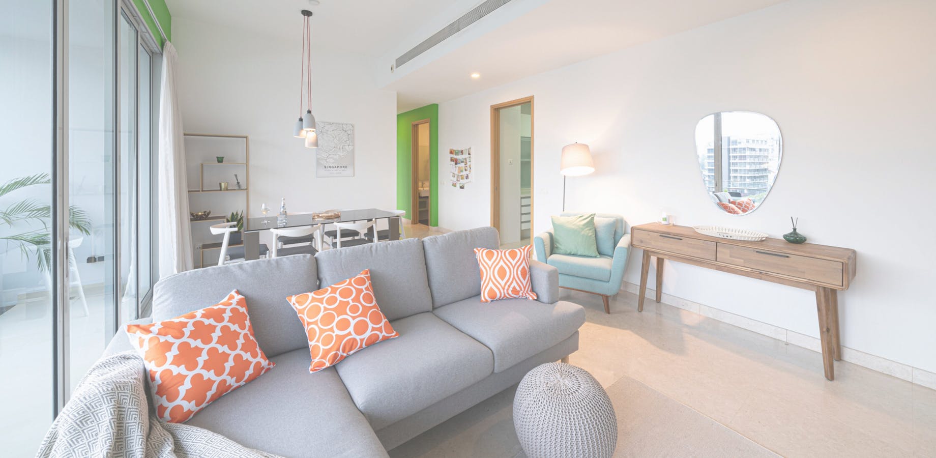
Casa Mia Coliving homes are located in exciting neighbourhoods full of character and easy to walk around for our members to start discovering and in places they want to live.
We select buildings and apartments that are centrally located with modern amenities for convenience and comfort.
Affordable
Affordable
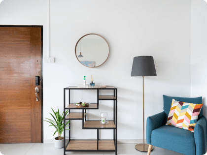
Our homes offer value for money for our members. Casa Mia Coliving homes come all-inclusive in one fee with a nominal monthly membership.
Community
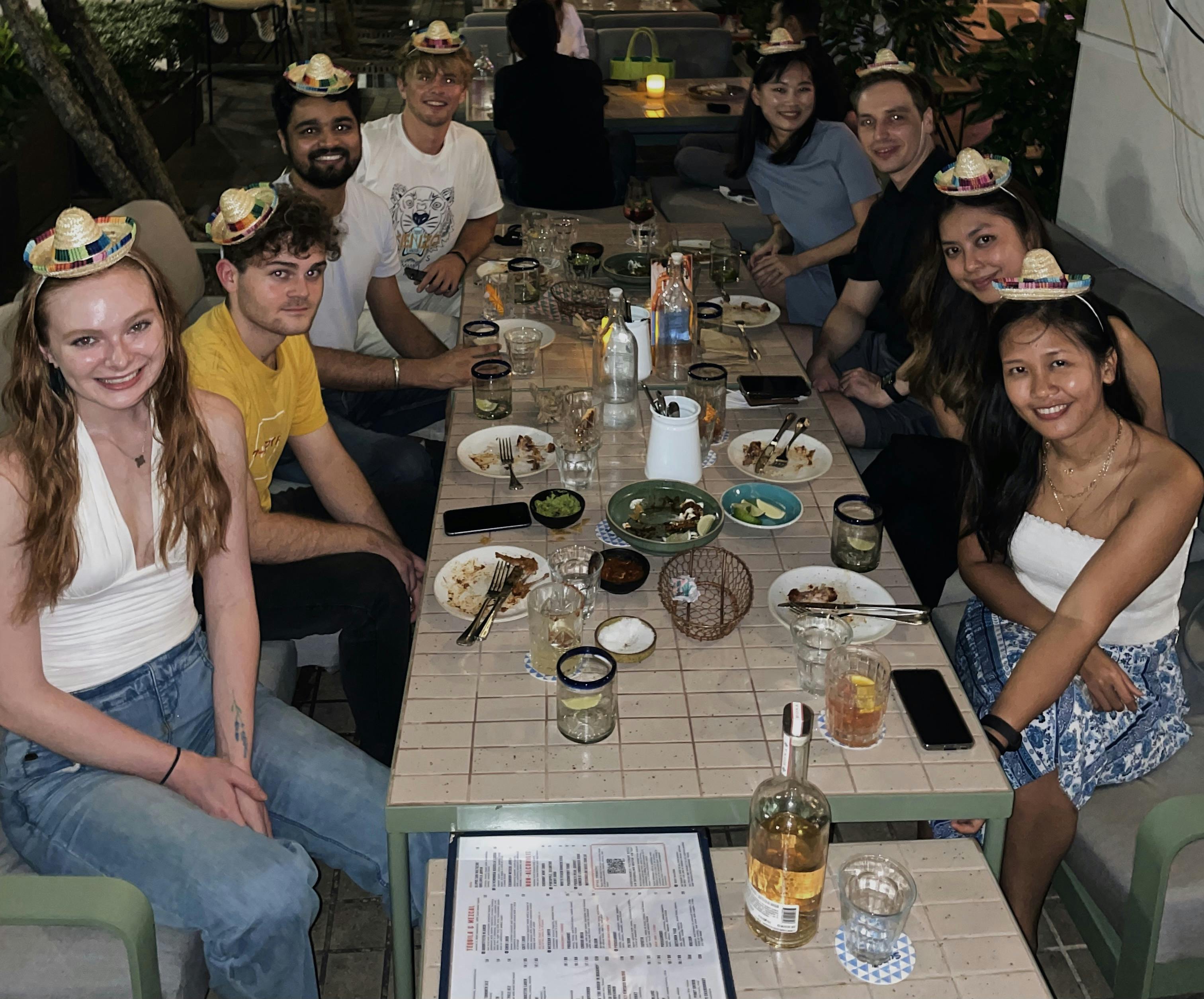
Community
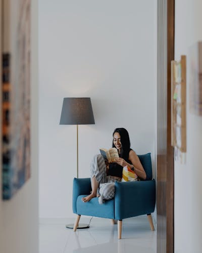
We enable your lifestyle in a new city. Make new friends with common interests. Welcome them to your Casa Mia Coliving home in style.
One-Stop Service
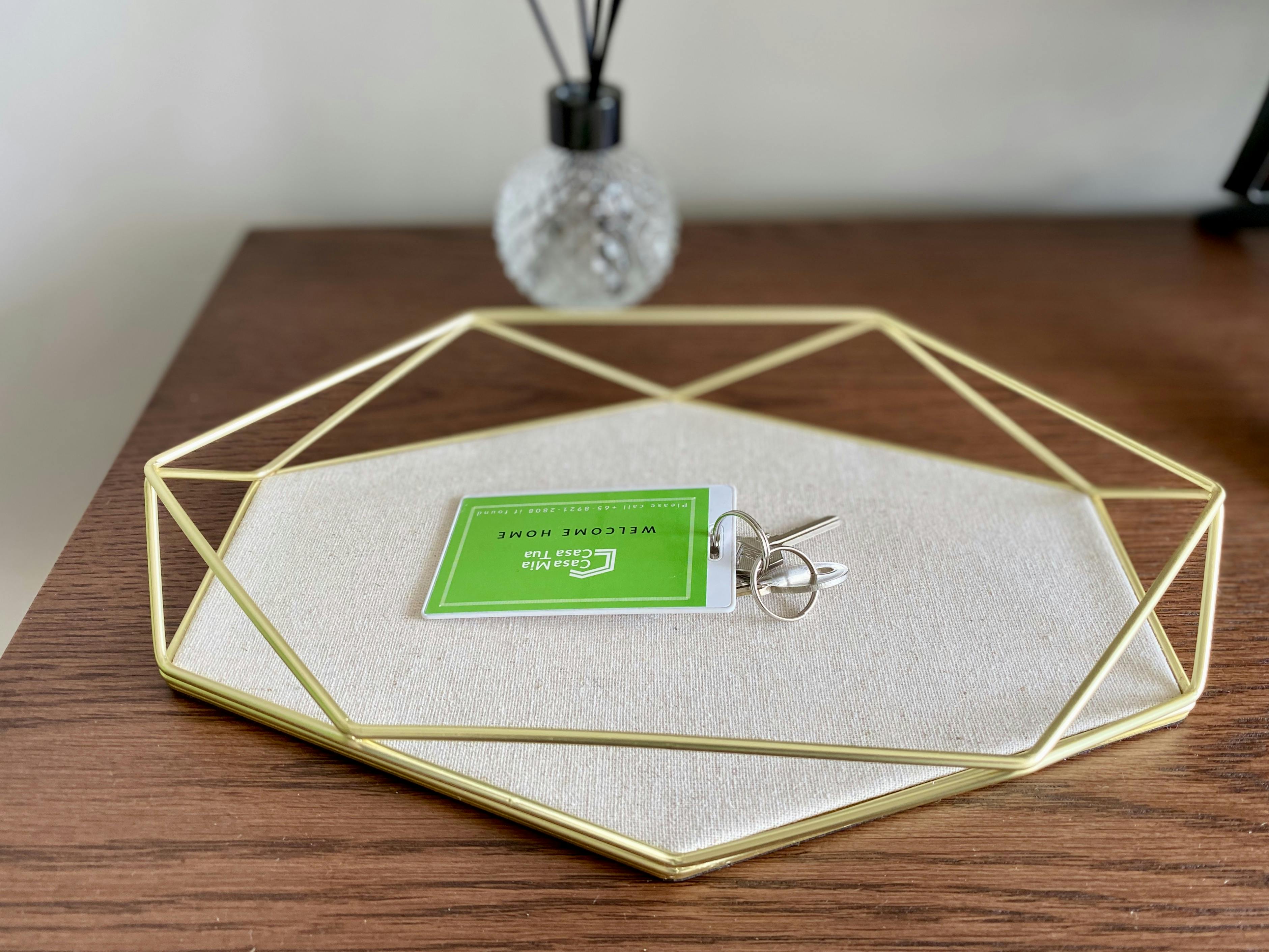
One-Stop Service
We offer young professionals to our city with an Easy Living experience that is easy and seamless from start to end.
